Font Styles in Technical Writing
Have you considered when and where to use certain font styles in your daily technical documents? Are font styles purely decorative in nature, or do they serve a more meaningful purpose? Which fonts are appropriate for technical writings?
In October 2018, Janel Miller, from the University of Wisconsin at Madison, gave a presentation on Improving Clarity, Coherence, and Conciseness in Technical Writing. Janel reviewed how to prepare coherent documents, engage and persuade readers, and apply principles of concise writing to improve clarity.
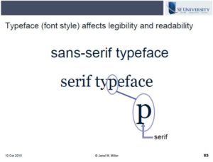
Janel also discussed the use of different typeface or font styles which can affect readability and legibility. Janel included the following slide showing the difference between serif and sans-serif fonts.
As you can see, the serif font includes small, decorative flourishes (called serifs) at the ends of the strokes, whereas the sans-serif (or without-serif) typeface does not. These small serifs may seem insignificant, but they actually serve a purpose for serif fonts such as Times or Georgia. Serifs help the reader follow lines of text when reading large blocks of text in print or reports. In contrast, sans-serif fonts, such as Helvetica and Calibri, are easier to read at a distance or on small screens and mobile devices. Sans-serif fonts are recommended for wayfinding signs on roads, presentations in PowerPoint, and text in emails especially when read on mobile devices.
Your font style selection may affect the ability of the audience to read the document accurately and quickly. Be sure to consider whether a serif or sans-serif font would be most applicable in your future technical reports, emails, or on-screen presentations in order to visually assist your audience in reading your technical content.


There are no comments yet, but you can be the first